How to Make Better YouTube Thumbnails Using the Thumbnail Triangle Theory
Learn how to make better YouTube thumbnails using the Thumbnail Triangle Theory. Three elements, proven CTR results, and step-by-step design tips inside.
Details
How to Make Better YouTube Thumbnails Using the Thumbnail Triangle Theory
Your click-through rate is sitting at 2%. You've checked your title, your tags, your posting schedule. You've done everything right. But the one thing sitting between your video and thousands of new viewers isn't your content quality or your SEO strategy. It's the small image nobody told you to take seriously.
Your youtube thumbnail is your storefront window, your book cover, your first impression. According to FluxNote, viewers decide whether to click in approximately 0.5 seconds, which means every element of your video thumbnail needs to communicate instantly or you've already lost them.
The good news is that there's a proven, repeatable formula that top creators use to consistently achieve the 7-10% click-through rate benchmark that YouTube's algorithm rewards. It's called the Thumbnail Triangle Theory, and once you understand it, your approach to thumbnail design will never be the same.
Why YouTube Thumbnail Design Is the Most Underrated Skill for Audience Building
Most new YouTubers obsess over video quality, lighting, and audio. Those things matter, but they're useless if nobody clicks on your video in the first place. Click-through rate is one of YouTube's most critical ranking signals. When your CTR is high, YouTube's algorithm interprets that as a signal that your content is compelling and relevant, and it pushes your video to more viewers. When your CTR is low, even the most brilliant video gets buried.
This is why the best thumbnails aren't just pretty pictures. They're strategic conversion tools. Every element of your video thumbnail should serve a single purpose: convincing the right viewer to click.
The creators who understand this are the ones building audiences at scale. The ones who don't are posting into the void, wondering why their subscriber count refuses to grow.
The Thumbnail Triangle Theory: A Three-Element Formula for the Best Thumbnails
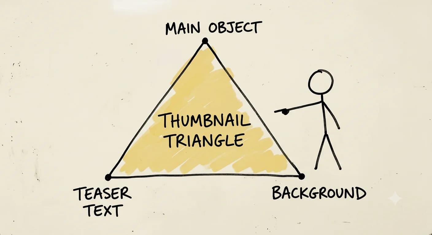
The Thumbnail Triangle Theory is elegantly simple. According to Mark Studios, effective thumbnails should contain exactly three elements competing for attention: a subject, a context object, and a text overlay. Think of it as a triangle where removing any one side causes the whole structure to collapse.
ThumbnailCreator describes this as the 3-Element Rule: one face, one focal object, and one short text block. When all three are working together, the thumbnail communicates your video's value in under a second.
Here are the three elements that make up the triangle:
 Element One: The Main Object
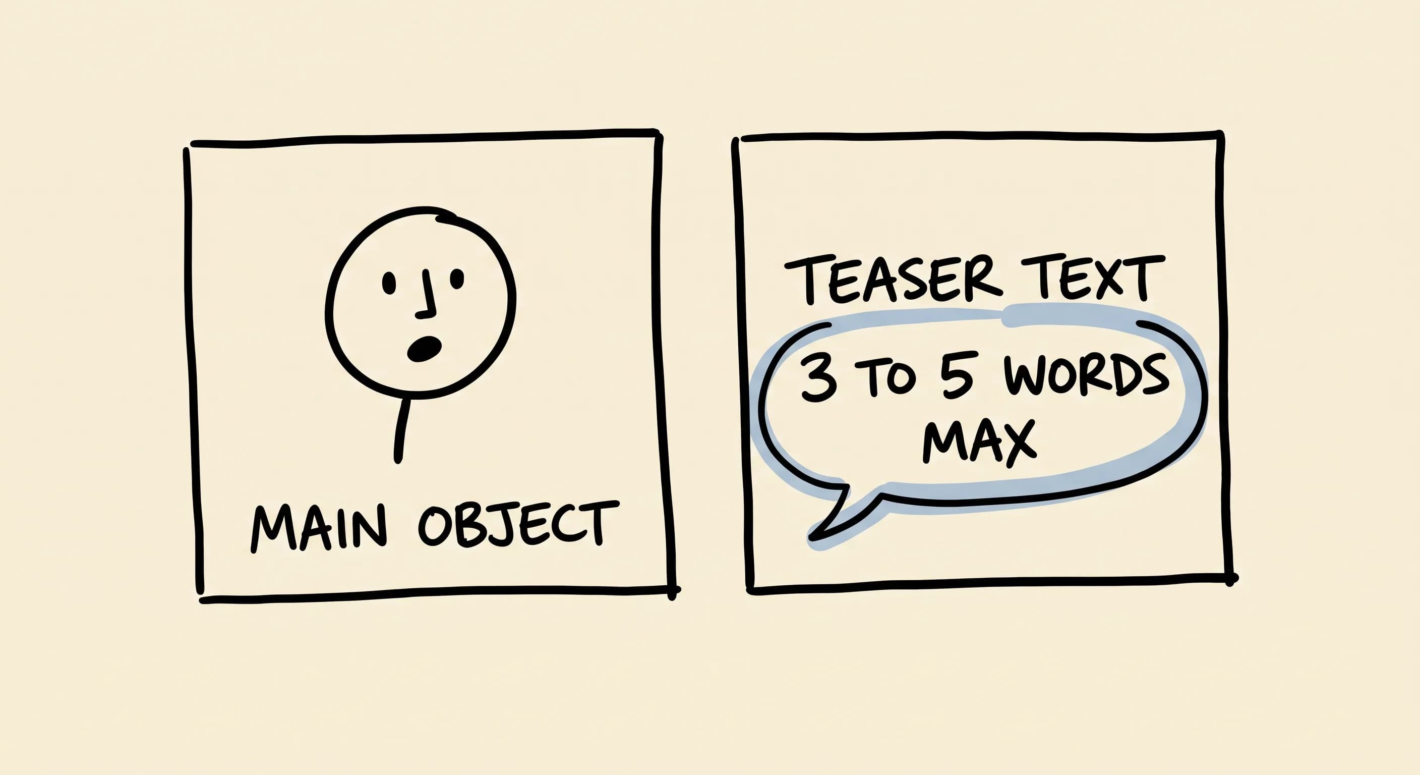
This is your primary visual focus, the single most important thing in your thumbnail. According to Transformation Junction, when your content is personality-driven, one expressive human face works best as the main object, with the subject taking up 30-40% of the frame. When the video isn't personality-driven, the main object becomes a focal product, graphic, or compelling image instead.
There should be no ambiguity. A viewer looking at your thumbnail for half a second should immediately understand what the main subject is.
Element Two: Teaser Text (3-5 Words Maximum)
Your teaser text isn't the title of your video repeated word for word. Repeat the title in your thumbnail and you're wasting valuable real estate. FluxNote and multiple expert sources confirm that thumbnail text should stay at 3-5 words maximum to remain legible at thumbnail size.
Your teaser text should function as a curiosity-gap hook, creating tension or adding a second layer of meaning that complements the video title rather than duplicating it. The font you choose matters enormously here. Bold, high-contrast fonts that are readable even in small thumbnail previews are essential. Avoid script fonts or anything decorative that sacrifices readability for style.
Element Three: Contrasted Background
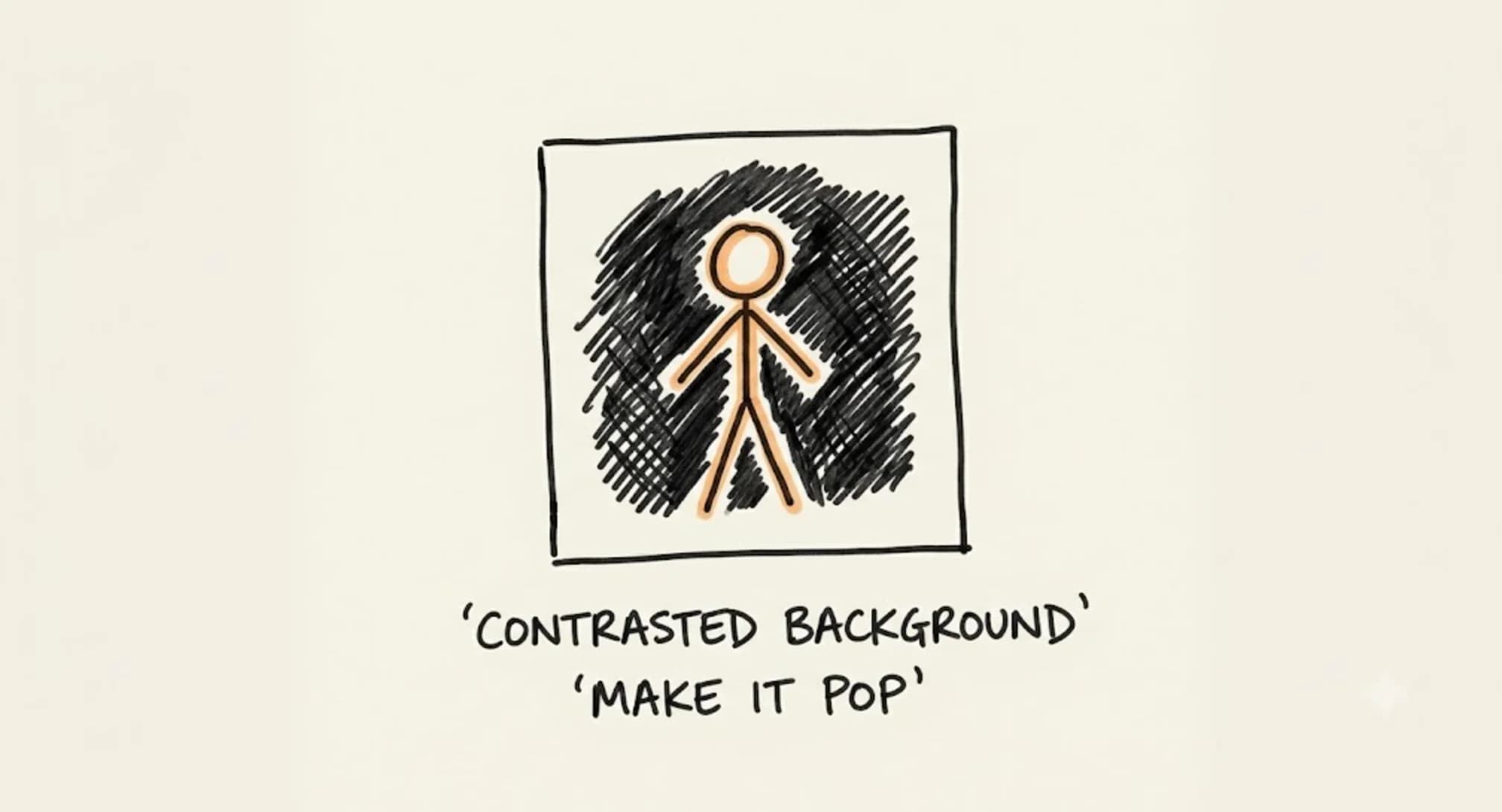 The background of your video thumbnail isn't an afterthought. It's structural. According to FluxNote, high contrast between foreground and background is a major driver of readability and attention in thumbnails. A contrasting background makes both your main object and your teaser text visually pop. It guides the viewer's eye exactly where you want it to go.
Whether you use a solid color, a blurred environment, or a strategic graphic background, the rule is the same: high contrast is non-negotiable.
When all three elements are correctly balanced and immediately make sense to your target viewer, your click-through rates will increase significantly. According to expert research, thumbnails featuring a structured three-part formula can achieve 10% CTR and above.
Thumbnail Best Practices: How to Make Your Thumbnail Work Harder
Knowing the three elements is the starting point. Implementing them strategically is where the results happen. Here are the thumbnail best practices that separate good thumbnails from great ones.
Make Your Thumbnail Speak to Your Ideal Viewer
The Triangle Theory only works when all three elements make immediate sense to your ideal viewer. A thumbnail that confuses its audience, even if it's visually beautiful, won't convert. Before you design a thumbnail, ask yourself: would my ideal viewer immediately understand what this video offers them? If the answer is no, redesign before you upload.
Use Human Faces Strategically
Thumbnails featuring human faces consistently outperform those without them. Human faces trigger an instinctive psychological response. We're wired to look at other people's expressions. Transformation Junction notes that the face-centered variant of the three-element formula is one of the most heavily used approaches in creator guidance, and for good reason.
When you use human faces in your thumbnails, choose expressions that match the emotional tone of your content. Surprise, excitement, concern, and delight are all powerful emotional cues that drive clicks. Many of the most successful YouTubers build their entire thumbnail brand around their own face paired with a signature expression.
That said, not every video calls for a face. When your content is tutorial-based, product-focused, or not personality-driven, Transformation Junction confirms that the main object simply replaces the face as the primary focal point in the three-element formula. The structure stays the same. Only the main object changes.
Choose the Right Font
Your font is doing more work than you might realize. The right font reinforces your brand identity while ensuring your teaser text is readable at thumbnail size. On many devices, that means viewing at roughly 168x94 pixels, and on mobile it can be even smaller. Stick to bold sans-serif fonts with strong visual weight. Make sure there's enough contrast between your font color and the background. Drop shadows or outlines can dramatically improve readability without sacrificing style.
Never Repeat the Title
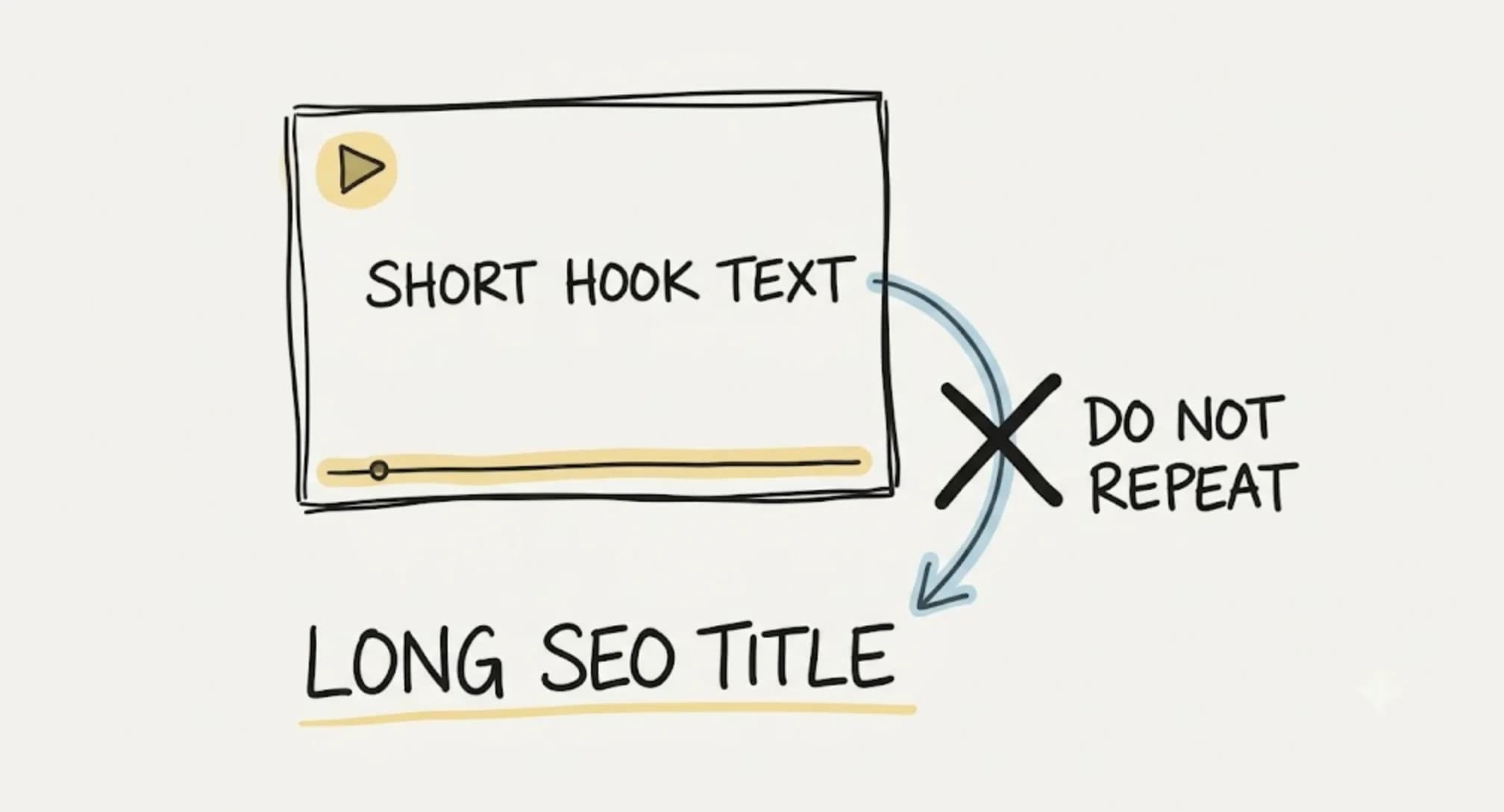 One of the most common thumbnail design tips gets ignored constantly: don't repeat your video title as your thumbnail text. Your thumbnail text and your video title should work together as a complementary pair. Your title handles the SEO and descriptive work. Your thumbnail text creates intrigue and emotional pull. Together, they should make a viewer feel like they absolutely can't skip this video.
How to Make YouTube Thumbnails: A Step-by-Step Implementation Guide
Ready to design a thumbnail that drives real results? Here's a practical process to follow every single time you upload a new video.
Step One: Identify Your Main Object
Before you open any design tool, decide what one visual element best represents your video's core message. This single decision is the foundation of your entire thumbnail. Everything else is built around it.
Step Two: Write Your Teaser Text
Brainstorm five to ten options for your three-to-five word teaser. Then eliminate ruthlessly. Keep only the option that creates the most curiosity or communicates the clearest value. Read it out loud. Does it make you want to click? If not, keep writing. Remember, the goal is a curiosity-gap hook that adds meaning beyond what the title already says.
Step Three: Choose a Contrasting Background
Select a background that makes your main object and teaser text stand out rather than blend in. Test your thumbnail design at small sizes. Mark Studios specifically recommends testing at mobile preview size, approximately 320x180 pixels, to verify readability and subject clarity before publishing. If the elements still pop at that size, you've done it right.
Step Four: Build Your Thumbnail Template
Creating youtube thumbnail templates for your channel is one of the smartest efficiency moves you can make. A strong template maintains visual consistency across your content, which builds brand recognition over time. Viewers begin to recognize your thumbnails in their feed even before they read the title. Tools like Canva, Adobe Express, and Photoshop all offer excellent options for building reusable thumbnail templates.
Step Five: Upload and Monitor Your CTR
Once your video is live, monitor your click-through rate in YouTube Studio analytics. Target a minimum of 7% CTR. If you're hitting 10% or above, you've created an exceptional thumbnail. If you're falling below 7%, consider running an A/B test with a redesigned thumbnail. Research recommends a test window of 48-72 hours with a minimum of 1,000 impressions for useful CTR comparison. That gives you enough data to make a confident call without waiting weeks for results.
What Do Most YouTubers Use to Make Their Thumbnails?
This is one of the most common questions from newer creators. The tools most YouTubers use to make their thumbnails include Canva, especially popular for its drag-and-drop interface and pre-built thumbnail templates, Adobe Photoshop for those with design experience, and Adobe Express for quick, professional results. Many creators also use Snappa, PicMonkey, or even smartphone apps for on-the-go thumbnail creation.
Regardless of which tool you choose, the Thumbnail Triangle Theory applies universally. The tool isn't the differentiator. The strategic approach is.
Why Is My Thumbnail So Low Quality on YouTube?
If your thumbnail looks blurry or pixelated after upload, the most common culprit is file size and resolution. YouTube recommends uploading thumbnails at 1280x720 pixels with a minimum width of 640 pixels. Your file should be under 2MB and saved as a JPG, PNG, GIF, or BMP. Always export at the highest quality setting available in your design tool before you upload.
Pairing correct export settings with the mobile preview test recommended by Mark Studios means you'll catch quality issues before they go live, not after.
Connecting CTR to Watch Time: The Full Picture
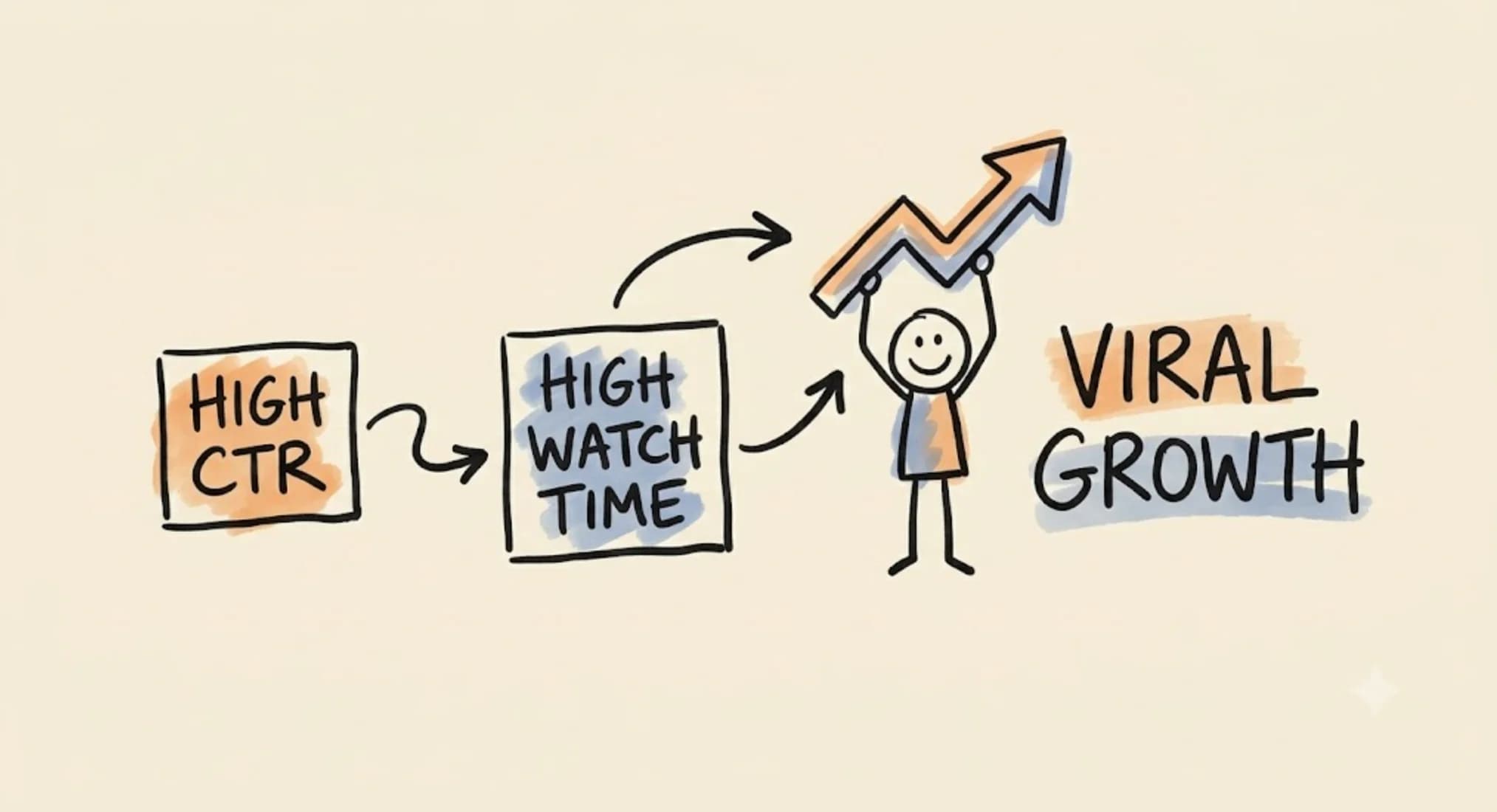 High CTR alone doesn't guarantee YouTube success. It has to be paired with strong watch time. If viewers click your thumbnail but leave within the first 30 seconds, YouTube reads that as a mismatch between your thumbnail promise and your content delivery. The algorithm penalizes that.
Aim for a watch time percentage above 35% alongside your 7-10% CTR target. When both metrics are strong, your videos have a genuine shot at trending within your niche. Your thumbnail brings them in. Your content keeps them there.
This is why the thumbnail text hook matters so much. When your teaser text accurately reflects the emotional experience inside the video, the viewers who click are the viewers who stay. That alignment between thumbnail promise and content delivery is what separates channels that trend from channels that plateau.
Final Thoughts on How to Make Good Thumbnails That Build Your Audience
The Thumbnail Triangle Theory isn't complicated, but it's powerful precisely because of its simplicity. Three elements, main object, teaser text, and contrasted background, working in harmony to speak directly to your ideal viewer. That's the formula the best thumbnails in every niche share.
Start implementing this with your very next video. Build a thumbnail template that reflects your brand. Use human faces when your content calls for it. Write teaser text that functions as a genuine curiosity-gap hook. Choose bold, readable fonts. Design backgrounds that make everything pop. Test at mobile size before you upload. Monitor your CTR, and when you need to, run a 48-72 hour A/B test with at least 1,000 impressions before drawing conclusions.
The creators who consistently build audiences on YouTube aren't necessarily those with the biggest production budgets or the most polished videos. They're the ones who understand that the click comes first, and they design every thumbnail to earn it.
Read more about Audience Building & Growth for Content Creators
📚 Complete Guides
- How to Build an Audience as a Content Creator
- How to Find Your Target Audience (Start With One Person)
⚡ Tactics & Strategies
- 30 Daily Outbound Pitches for UGC Deal Generation
- 50% Retention Rate Optimization for YouTube Algorithm Success
- Age Bracket as Superpower Strategy for Older UGC Creators
- Audience Consistency Strategy to Avoid Algorithm Penalties
- Audience Psychology Over Algorithm Optimization, Focusing on Human Pain Points and Goals Instead of Platform Tactics
📄 Related Articles
- How to Get More Instagram Story Views: The STD Strategy
- Questions to Ask Your Audience on Social Media (That Get Replies)
- Cold Email Outreach: A 90-Day System for Creators
- Instagram Lead Generation: The Comment-to-Get Strategy
- Influencer Gifting: The Creative Method That Wins Collabs
- Voice of the Customer: A Creator's Guide to Magnetic Messaging
- How to Ask Someone to Be on Your Podcast (And Actually Get a Yes)
- Brand Differentiation: The Three Circles Framework
Read more YouTube Resources for Content Creators
📚 Complete Guides
⚡ Tactics & Strategies
- 50% Retention Rate Optimization for YouTube Algorithm Success
- Candy vs Vegetables Packaging Strategy for Educational Content
- Click-Through Rate Optimization as YouTube's Primary Success Metric
- Creating Viral Content Through Polarizing and Educational Hooks
- Doubling Production Effort Per Video to Exponentially Increase Views
🧮 Calculators

Alex Kirillov
Details
One link. Every channel, rate, and piece of work brands need to evaluate you. Built for how creators actually get hired.
Claim your profile
Live creator, content, and marketing roles from real companies, with the pay, market, and context the raw job page never gives you.
Browse jobs